This project focuses on redesigning the accommodation booking experience by reviewing the existing app and identifying usability issues. I improved the main booking flow, property details page, and dashboard to make the experience clearer and easier to use. The goal was to reduce confusion, improve trust, and create a simple booking process for users.
Timeline
1 Week
Tool Used
Figma
Project Type
Personal Project
Introduction
Hamhey is a platform that helps students and young professionals find accommodation in a new city.
Users can browse properties, check details, and book rooms through the app. Since most users are relocating, the experience needs to feel clear, trustworthy, and easy to follow.
While reviewing the existing app, I noticed usability issues in the sign-up flow, property listing, details page, and booking process.
Some screens had too much information, some actions were unclear, and important details were not shown at the right time.
This project focuses on improving the core booking journey to make the experience simpler, more structured, and more confident for users.
While testing the app as a guest user, I found multiple usability issues that affected the booking experience.
Sign-up flow had friction and unclear steps
Onboarding actions were not labeled properly
Dashboard had low contrast and weak hierarchy
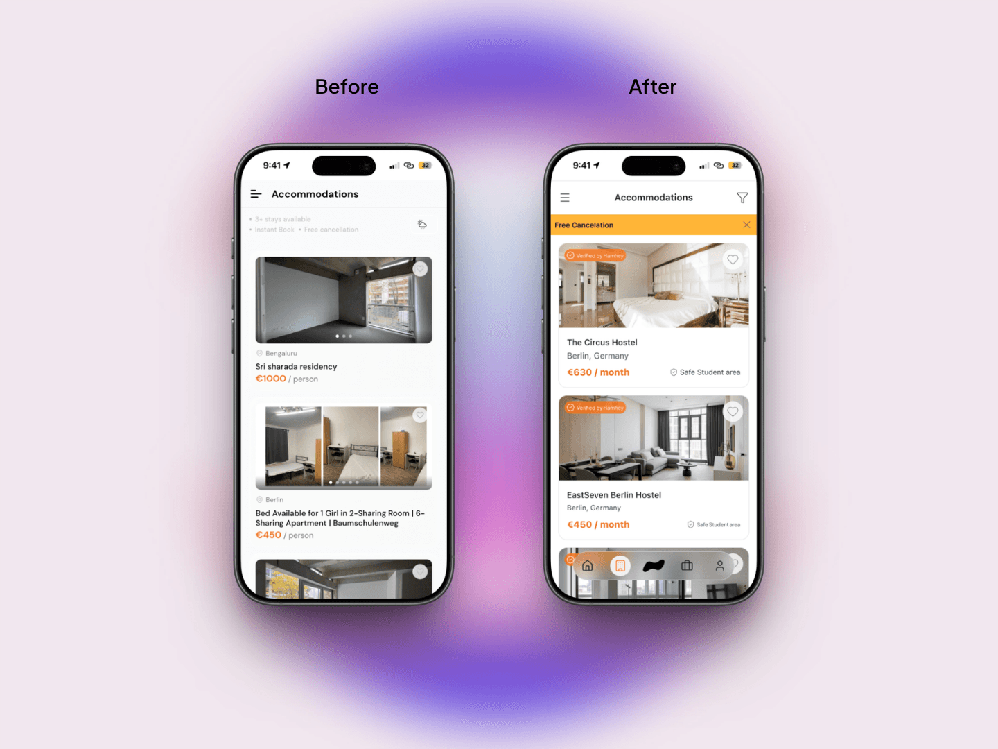
Listing cards lacked trust signals
Property details page felt long and crowded
Booking flow showed price before room selection
Multiple CTAs created confusion
Important sections were always open, increasing scroll length
Since users are booking accommodation in a new city, the experience must feel safe, clear, and predictable, but the current flow felt inconsistent.
The main problem was not only UI, but the lack of clear booking structure.
In the redesign, I focused on simplifying the booking flow and improving visual hierarchy.
Key changes:
Improved contrast and spacing on dashboard
Updated listing cards to show price, details, and trust badges clearly
Reorganized property details page for better reading flow
Show total cost only after room selection
Reduced multiple CTAs to one clear primary action
Made long sections collapsible
Fixed floating navigation spacing
The goal was to make every step feel intentional and easy to understand.
The redesigned flow makes the booking process more structured and easier to follow.
Users can understand property details faster
Booking flow now follows logical order
Trust badges improve confidence
Better spacing improves readability
Less scrolling on details page
Clear CTA reduces mistakes
The experience now feels more suitable for users who are making an important decision like booking accommodation.
The redesign makes the accommodation booking experience clearer, faster, and more reliable.
Reduced confusion during booking
Better visual hierarchy
Improved trust while browsing properties
More structured booking flow
Cleaner property details page
The final design keeps the experience simple while supporting the information users need to make a decision