Improving booking, virtual consultation, payment, and health records experience through research-driven UX redesign.
Timeline
2 Weeks
Tool Used
Figma
Project Type
Case Study
While studying hospital websites and booking apps, I noticed that the appointment booking process is often confusing and time-consuming. Users struggle to find the right doctor, select time slots, and manage prescriptions smoothly.
Most existing systems focus on adding features, but real hospitals still follow manual and complex workflows. Because of this, the digital experience often feels disconnected from how the process actually works.
Many platforms are also not designed for all age groups, especially elderly users, which makes the booking journey harder to complete.
This showed that the problem was not only in the UI, but in the overall booking workflow.
The goal of this redesign was to make the booking experience simple for users and practical for hospitals.
From the user side, the flow should be easy to understand, quick to complete, and usable for all age groups including senior citizens. From the hospital side, the system should support real workflows like manual prescriptions, reception handling, and flexible payment options.
The redesign was done by balancing user convenience with hospital usability.
Before starting the redesign, I explored hospital apps, booking portals, and user reviews to understand how appointment booking works in real situations.
Sources
• Hospital websites and mobile apps (Apollo, Practo, hospital portals)
• Articles about healthcare apps and UX
• User reviews on Play Store and Reddit discussions
• Watching real booking flows on different apps
• General observation of how hospitals handle appointments
Current user flow:
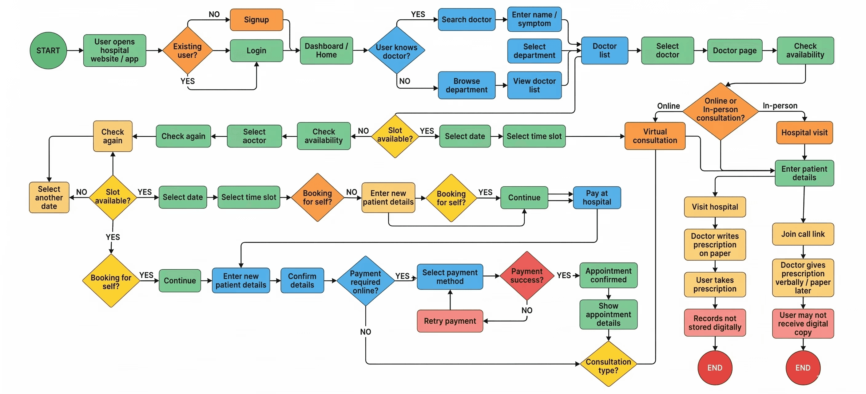
Most systems look clean visually, but they don’t follow how hospitals actually work.
Because of this, the experience feels correct at first, but becomes complicated during real use.
I decided to design the flow by keeping both sides in mind:
The user should find the process simple
The hospital should still be able to follow their workflow
The redesign needed to balance digital experience with real-world operations.
From user side
Difficult to find the right doctor
Specialization not clearly shown
Too many steps in booking
Payment flow not always clear
Virtual consultation confusing
Elderly users may find it complicated
From hospital side
Prescriptions still written on paper
Reception manages bookings manually
System doesn’t match real workflow
Doctors re-enter data multiple times
Online and offline records not connected
Because of this, the overall experience feels slow and disconnected.

Since real interviews were not conducted, I created realistic assumptions based on research.
Users aged 16–60+, including senior citizens
Users may book for themselves or family
Booking can be online or offline
Some users already know the doctor
Hospitals may still follow manual process
These assumptions helped in designing a flow that feels practical and believable.

The redesigned flow made the appointment booking process simpler and easier to understand. The new journey reduces unnecessary steps, makes slot selection clearer, and allows users to access their prescriptions later through health records. The design also supports real hospital workflow by allowing manual prescriptions, flexible payment options, and family booking. Overall, the new experience feels more practical for users while still working for the hospital system.
This project helped me understand that good UX is not only about making clean UI, but about understanding how the system works in real life. While working on this redesign, I learned how important research is, especially in healthcare where both user and hospital workflow must be considered. I also learned that sometimes the best solution is not the most modern one, but the one that fits real usage. This project improved my thinking about user journeys, assumptions, and designing for real-world scenarios